I was lucky enough recently to have been asked to be part of the new design team over at the 'Fun With ATC's' challenge blog.
It's a great team and I am sure some of you will already know the other members.
The theme this fortnight is 'Fashion' so we would love to see all your takes on fashion. Head over to see what the DT have been up to and of course we would love to see you there.
Now, I love making Atc's, since I found out what they were earlier this year I have had loads of fun making them, they are a great way to try out new ideas/techniques on a small scale before going big and they are great things to swap with fellow crafters.
Making this Atc was great fun, I got to step outside of my comfort zone with the theme but could still go all shabby which always makes me happy. although you should have seen the discarded pile I had at the end ;)
I started by cutting the atc out of mount board using the Tim Holtz die.Mount board is greeat, nice and thick and strong, I will be using it for all of my atc's from now on I think.( i have the vagabon machine not sure how mount board will cut with the other machines) for the background colour I dabbed the distress ink pads onto my craft mat, paper,corduroy and a little pumice stone, sprayed with some water and swiped the card through it, I dried it of with an iron and kept going till I got the right colour. The background was stamped with the paris word stamp from the Papilion set from Tim and the corset is a new buy from Katzelcraft they were stamped in archival in sepia and coffee.
The dress form is one of the movers and shapers mini die's from Tim Holtz this was again cut from mount board, I used the Frantage embossing enamel in aged teal. Its the first time I have used these powders and I love the way the gold and silver pigment melts into the blue. I think it gives it a Japanese feel to the dress. I finished it off with a pair of scissors to help balance the silver of the dress.
It would be great to see as many of you as possible over at Fun With ATC's
As always a great big thank you to all of you who follow and comment on my blog, new friends and older friends, it always means a lot to me to see you here.
I would like to enter this into the challenge over at Victorine Stamps they are having a Bingo challenge, the line I have chosen is Embossing, Colouring and brads/pearls. the dress form is embossed the back ground has been coloured with distress inks and my brad is the scissors.
Tuesday, 6 November 2012
Thursday, 1 November 2012
Haunted design house part 2
Just a quick post today, as promised here is the finished secret book I started to show on Monday, it is now finished.
Over at Haunted Design House the challenge this week is Hammer Horror, we want to see all your Hammer Horror inspired makes, weather it is tributes to the classic actors or making your own version of their iconic movie posters we would love to see them. If you head over to Hdh you will also see what the DT have been busy creating.

So after Mondays post I needed to do the back cover and line the secret draw.
I used the same technique for the back as I did for the front,Here is a LINK if you want to read a little more detail of what's been done. I selected another Hammer Horror movie still to use for an image transfer, a little more black on this image so the back ground colours are a little more subtle, As the colours were more muted I wanted to add more in the way of the cracks so I made sure I had a good base coat of matt medium down first as you need a non porous surface to get the best results.
For the draw I used some of my Graphic 45 Paper and cut the paper out in one piece, scored along the folds and glued it into place. I gave it a quick coat of translucent yellow oxide acrylic paint and then a watered down wash of a brownie red.
I did try to add some gold leaf to the spine of the book, the Hammer Horror logo and some script but for some reason I could not get a clear adhesion to the modelling paste so I have re painted it for now, need to experiment a little more.
For the pages of the book I used Tim tape and again painted with translucent yellow oxide paint and then a little brown dry brushing.
I'm going to group Mondays pics here as well as I would like to enter this into a few challenges and want all the pics in one place.


I would like to enter this in to the challenge over at Anything But A Card their challenge is Incorporate Black into your project.
Over at The Sisterhood Of Crafters they have a Halloween challenge. I think Hammer Horror and Vampires fits the bill.
Over at Haunted Design House the challenge this week is Hammer Horror, we want to see all your Hammer Horror inspired makes, weather it is tributes to the classic actors or making your own version of their iconic movie posters we would love to see them. If you head over to Hdh you will also see what the DT have been busy creating.
So after Mondays post I needed to do the back cover and line the secret draw.
I used the same technique for the back as I did for the front,Here is a LINK if you want to read a little more detail of what's been done. I selected another Hammer Horror movie still to use for an image transfer, a little more black on this image so the back ground colours are a little more subtle, As the colours were more muted I wanted to add more in the way of the cracks so I made sure I had a good base coat of matt medium down first as you need a non porous surface to get the best results.
For the draw I used some of my Graphic 45 Paper and cut the paper out in one piece, scored along the folds and glued it into place. I gave it a quick coat of translucent yellow oxide acrylic paint and then a watered down wash of a brownie red.
For the pages of the book I used Tim tape and again painted with translucent yellow oxide paint and then a little brown dry brushing.
I'm going to group Mondays pics here as well as I would like to enter this into a few challenges and want all the pics in one place.
I would like to enter this in to the challenge over at Anything But A Card their challenge is Incorporate Black into your project.
Over at The Sisterhood Of Crafters they have a Halloween challenge. I think Hammer Horror and Vampires fits the bill.
Monday, 29 October 2012
Haunted Design House, Hammer Horror
Well another week has rushed past and I have no idea where all the time is going at the moment.SO sorry if I have not been leaving as many comments as usual but I am getting around to see all your works.
Anyway on to this weeks challenge at Haunted Design House, the theme this week is 'Hammer House Of Horror'. We want to see all your Hammer Horror inspired pieces of art. They have produced so many films over the years with legendary actors like Peter Cushing and Christopher Lee and they are still going strong today making movies like 'Let me in' and 'Lady in black'
Why not head over and have a peak at what the DT have been inspired to make and then jump in and have a play.This is the last main challenge before the DT takes a little break so don't miss out on all the fun ;)
My project this week is still a work in progress, so consider this post part one so to speak, I will be posting the rest later in the week.
I started off with one of those secret draw wooden books, it gives you a nice canvas to work off of and scope for several ideas. I started with the spine of the book (the draw) I wanted to make this look like an old leather bound journal, I used some string and modelling paste to get the texture and used one of Andy Skinners Time Worn acrylic paint techniques to get the colour I was after, I am quite pleased with how this has turned out so far, I have a few ideas on how to add to it, Hopefully they will work and you will be able to see it later in the week.
For the main image I trolled through the internet to find a suitable image that would work for what was in mind, I found this great image of Peter Cushing and printed it off so I could do an image transfer.
The background/front cover of the book was painted with an acrylic paint base of white and then the colour was added in places, I tried to add colour so the red and blue would be outside the main image and shades of cream and green would give some colour to Peter. These dabs of colour have been applied rather hap hazard to give a rough feel rather than pristine painting. They were then painted over with another coat of white and when dry sanded back to reveal the distressed back ground.When it was all dry I could add my image, So far so good, I am really happy with how he looks on the front cover.

The Cross was added, It was made from one of those wooden coffee stirrers you get at places like costa coffee etc. It was cut and glued, painted with acrylic paint and then wrapped with wire, the little bat charm is from the bead shop in Brighton and again he was just stuck down on top of the cross.
So far so good, lets hope I do not ruin it with part two. ;)
Thanks as always for stopping by, and again so sorry for not being as active in blog land as I want to be, life is getting in the way at the mo as am currently house hunting and sorting all the faff you need that goes along with it.
Hopefully I will see you over at Haunted Design House and latter in the week for part two. x
Anyway on to this weeks challenge at Haunted Design House, the theme this week is 'Hammer House Of Horror'. We want to see all your Hammer Horror inspired pieces of art. They have produced so many films over the years with legendary actors like Peter Cushing and Christopher Lee and they are still going strong today making movies like 'Let me in' and 'Lady in black'
My project this week is still a work in progress, so consider this post part one so to speak, I will be posting the rest later in the week.
I started off with one of those secret draw wooden books, it gives you a nice canvas to work off of and scope for several ideas. I started with the spine of the book (the draw) I wanted to make this look like an old leather bound journal, I used some string and modelling paste to get the texture and used one of Andy Skinners Time Worn acrylic paint techniques to get the colour I was after, I am quite pleased with how this has turned out so far, I have a few ideas on how to add to it, Hopefully they will work and you will be able to see it later in the week.
The background/front cover of the book was painted with an acrylic paint base of white and then the colour was added in places, I tried to add colour so the red and blue would be outside the main image and shades of cream and green would give some colour to Peter. These dabs of colour have been applied rather hap hazard to give a rough feel rather than pristine painting. They were then painted over with another coat of white and when dry sanded back to reveal the distressed back ground.When it was all dry I could add my image, So far so good, I am really happy with how he looks on the front cover.
The Cross was added, It was made from one of those wooden coffee stirrers you get at places like costa coffee etc. It was cut and glued, painted with acrylic paint and then wrapped with wire, the little bat charm is from the bead shop in Brighton and again he was just stuck down on top of the cross.
So far so good, lets hope I do not ruin it with part two. ;)
Thanks as always for stopping by, and again so sorry for not being as active in blog land as I want to be, life is getting in the way at the mo as am currently house hunting and sorting all the faff you need that goes along with it.
Hopefully I will see you over at Haunted Design House and latter in the week for part two. x
Monday, 22 October 2012
Haunted Design House 'Nosferatu'
I would like to enter this into a few challenges,
Over at Anything But A Card they are having a Halloween or Halloween colours challenge. They are a fairly new challenge blog with a fantastic DT, head over for some awesome inspiration.
At Smudgy Antics they are having a Monster Mash theme. For my monster mash I have Nosferatu and the Op monster .
Thursday, 18 October 2012
A Rusty Frame.
I find this whole crafting thing a very funny mistress, you have highs and lows, days where the mojo is just not working. That's how I felt last week. I had the idea of what I wanted to do with the frame and thought the rest would flow, It did not ;) I was left with a painted frame and nothing to go inside, also new the rust needed adornments but again mind went blank.
The finishing touches were added, the glass squares are from the bead shop in Brighton, the tap and number plate are from Tim Holtz, the tap was quickly painted with red acrylic and when it was touch dry rubbed with a kitchen towl/wet wipe to distress it back to the metal underneath. the number was coated with alcohol inks.
The little copper piping thing was made from some copper right angle joins bought in homebase, I glued them together and painted them with acrylic paints. Again another Andy Skinner technique from his Time Worn workshop.
All in all I think I like it now, not sure if the image fits the frame but I like how the colours work and am much happier with it this week than I was last week.
Thank you every one for stopping by and reading all my ramblings. And I have just seen I have Hit 100 followers, Wow is all I can say, never thought I would enjoy looking at blogs and people would enjoy looking at mine this much. I really can not welcome and thank you all enough. Mark xx
I would like to enter this into a few challenges,
Simon Says Stamp And Show have a 'Your Favourite' challenge, I just love industrial grunge and altering 3d objects.
The No Matter Which Challenge is Halloween or Halloween colours, I goofed up with Mondays entry as I did not use a stamped image, Doh. Hopefully clowns in straight jackets are scary enough, I know I hate clowns ;)
Anything But A Card are having their 4th challenge, 'Autumn/Fall or Halloween colours' This is a great new challenge blog and if you are like me, someone who hates making cards go check them out.
Monday, 15 October 2012
Haunted design house challenge, 'Graves'
Hello again everyone and thanks a lot for stopping by, It's always good to have you here.
This week over at Haunted Design House we are challenging you with the chilling theme of 'R.I.P' all you have to do is make something grave related.
This is my little Grave shrine. It was made in a class given by Andy Skinner at The Craft Barn
We started of with a wooden plaque (actually it was a thermometer) turned it over and painted the plaque with a few layers of acrylic paint.We then used an image transfer technique involving Matte medium, when it was all dry I used the 2 stage crackle glaze from deco art to age it up.


The metal strip across the bottom was added and given one of Andy's rust techniques from his online workshop 'Time worn' I also used the same technique for the top. The photo was aged up with distress inks and added to the cut out section. I used alcohol inks on a pair of Tim Holtz Wings. I also added the book plate with the name Jane (no idea why i chose that name) Finally I screwed an eyelet into the bottom and attached the little memory tag saying 'cherish' along with a feather.
Head over to Haunted Design House to see plenty of Fab inspiration from the awesome design team and of course we would love to see you.
I would like to enter this into the challenge over at Simon Says Stamp And Show, their challenge this week is 'Your favorite'
This has so many of my faves in it, I love the rusty tech and making anything shabby/vintage. It also appeals to my dark side.
so all in all this make was right up there for me.
I would also like to enter this in to the Art With No Boundaries challenge.They have a Halloween theme running this month. Hopefully a Grave shrine is Halloween enough ;)
Over at No Matter Which Challenge their challenge is Halloween or Halloween colours. Again hopefully a grave shrine will be Halloween enough.
The Crafty Pad are having a 'Distress it' challenge. I love distressed challenges ( I can not do clean and simple) ;)
This week over at Haunted Design House we are challenging you with the chilling theme of 'R.I.P' all you have to do is make something grave related.
This is my little Grave shrine. It was made in a class given by Andy Skinner at The Craft Barn
We started of with a wooden plaque (actually it was a thermometer) turned it over and painted the plaque with a few layers of acrylic paint.We then used an image transfer technique involving Matte medium, when it was all dry I used the 2 stage crackle glaze from deco art to age it up.
Head over to Haunted Design House to see plenty of Fab inspiration from the awesome design team and of course we would love to see you.
I would like to enter this into the challenge over at Simon Says Stamp And Show, their challenge this week is 'Your favorite'
This has so many of my faves in it, I love the rusty tech and making anything shabby/vintage. It also appeals to my dark side.
so all in all this make was right up there for me.
I would also like to enter this in to the Art With No Boundaries challenge.They have a Halloween theme running this month. Hopefully a Grave shrine is Halloween enough ;)
Over at No Matter Which Challenge their challenge is Halloween or Halloween colours. Again hopefully a grave shrine will be Halloween enough.
The Crafty Pad are having a 'Distress it' challenge. I love distressed challenges ( I can not do clean and simple) ;)
Monday, 8 October 2012
Haunted Design House 'Bats In The Belfry' Challenge And Swap
This week I am killing two birds with one stone, (no not some kind of ritual slaying) I made this ATC for the challenge and also as part of a swap, with Suzanne,more of that in a minute.
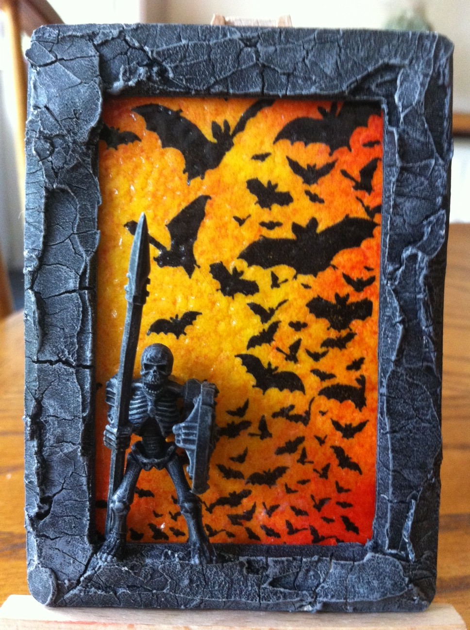
This Atc was made using one of my new stamps from Artistic Outpost, one of their Halloween sets. the frame was cut out from a couple of sheets of card and glued together to make the 3d frame, It was then covered in Deco Arts crackle paste and painted with acrylic paints. the little figure is from the Games Workshop. It feels very odd going in there at 35 buying their figures. The back ground was done using distress inks and then covering it in UTEE.
The second Is a Paper Artsy stamp stamped onto acetate and attached with a couple of brads to a distressed back ground, Th BG was done with acrylic paint, red over white over silver, this was then sanded back in places so the different layers would show through. It was finished of with some wire wrapped around just to give it a little more depth.
Now I was blown away with this swap, Suzanne not only did three stunning ATC's she also added a rather amazing care package as well that contained all sorts of goodies. (I am a very lucky boy).
Above are the atc's please check Suzanne's blog there are some great projects for you to feast your eyes on.Below are all the amazing extras she sent me as well. It was like Xmas.
As well as all these goodies I also received a Stampotique stamp, Probably my fave stamp company and some stamped up images from her stash of stamps, One of which I used last week for my fat book page.
Luckily I did have something already made for Suzanne for this swap. A little while back I made a KISS (keep it simple stupid) green frame with a Stampotique image inside which I think she liked at the time, So with my fingers crossed I hoped Suzanne liked the colour blue and did another frame in the same style with a different Stapotique image.I forgot to take a pic of this before posting so thank you again Suzanne for sending me the pic (incase you were wondering why that pic looks better than the ones I take )
Thanks for reading this far. As always I love having you here and reading your comments. It would be great to see you all over at Haunted Design House letting your inner demon out ;)
Thanks, xx
I would like to enter my Bella donna Atc into a challenge over at Digi Galore where the theme is Goth.
They are a digi only challenge.
I would also like to enter these pieces into the challenge over at Art With No Boundaries they have a 'Halloween' inspired challenge for the whole month of October, It's been a little while since I joined in over there.
Saturday, 6 October 2012
Something a little colourful ;)
Just a quick and simple post today, I have been playing around with the Dylusion sprays, Bright colours are not really my thing so I wanted to come out of my comfort zone.This tag was inspired by demo's I saw a little while back by Linda Elbourne she is a master/mistress of tim holtz and ranger style crafting, Running a pub last I heard so I hope we get to see her back in a craft room soon.
I cut my tag from some mount board and coloured it up with orange Dylusion sprays with a little bit of the yellow in the top and bottom. when they were dry i added some of the ripe persimmon re inker and smeared it all over the top, it bought out and gave a real richness to the colours.

I then stamped the mushrooms, made a mask for them and then over stamped with Tims Honey comb in a light orange and then stamped the leaves with a darker red archival ink, the sentiment is also from Dyan Reaverley 'the world of reality has its limits, but the world of imagination is boundless' I coloured the mushrooms with the pink dylusion spray applied with a brush. the white spots were done with my jell pen as were the dots on the leaves. The stamped girlie is from Tim Holtz, I cut her wings off, she has the sentiment 'be yourself' and I think it fits quite well with the Dyan senti. I coloured her with copics in contrasting colours.
the ribbon was scrunched up and sprayed with orange Dylusion's and then rubbed in some Fired Brick distress ink. I also added some frilly wire ribbon, this was coloured with blue and purple sprays to match the little girl.
I would like to enter this into a couple of challenges, over at Simon Says Stamp And Show their theme is Leaf-spiration, basically use leaves ;)
I would also like to enter this into the challenge over at The Artistic Stamper their challenge for October is 'The natural world'
Thank you everyone new and old who keep visiting and leaving comments, It constantly blows me away. Thank you all xx
I cut my tag from some mount board and coloured it up with orange Dylusion sprays with a little bit of the yellow in the top and bottom. when they were dry i added some of the ripe persimmon re inker and smeared it all over the top, it bought out and gave a real richness to the colours.
the ribbon was scrunched up and sprayed with orange Dylusion's and then rubbed in some Fired Brick distress ink. I also added some frilly wire ribbon, this was coloured with blue and purple sprays to match the little girl.
I would like to enter this into a couple of challenges, over at Simon Says Stamp And Show their theme is Leaf-spiration, basically use leaves ;)
I would also like to enter this into the challenge over at The Artistic Stamper their challenge for October is 'The natural world'
Thank you everyone new and old who keep visiting and leaving comments, It constantly blows me away. Thank you all xx
Monday, 1 October 2012
Lexi's Creations Guest DT piece PINK!!!
A couple of weeks ago I was lucky enough to be drawn to be the guest designer over at Lexi's Creations and of course when the email came through with the details I was very excited, I was still excited but a little shocked when I saw the Theme for the challenge. 'PINK' lol, Now that is a challenge ;)
Now the theme is pink for a reason, In October it is Breast Cancer Awareness month, A very good cause obviously and I am really happy that I might be able to make something to highlight the cause in some way even if its just a little.
This is a 2 week challenge and is sponsored this week by My Heart Pieces they are a digi stamp company. lots of images to choose from.
I decided to make a tag for this project but obviously could not make it too girly ;)
I cut the tag using the Tim Holtz die and coloured it with spun sugar distress ink and then added some worn lipstick and Victorian velvet to give some depth to the colour. The tag was embossed with one of my folders and gone over with the darker pinks so you could see the details.
The flower was printed out and then coloured with my copics, nothing technical just straight colours as I wanted it to be clean and simple.I painted over the image with matt glue and seal so it would resist the distress inks when I came to do the background. As you can see the image was torn out, it was then distressed with worn paper and the edges were done with vintage photo and walnut stain. I then went over the whole thing with victorian velvet to blend it all together and have a worn pink look. it was attatched with a Tim paper clip.I also went round the edges of the main tag with the vintage photo and walnut stain.
I added the brown patterned ribbon down one side and used the tinny attacher to stick it down, I also added two pink ribbons to act as the Breast Cancer ribbon.
The heart and Butterfly come from the bead shop in Brighton, I cut their eyelets off so they did not just look like charms stuck down.
the 'Live Life' comes from Tims sticky words pad and they seemed quite fitting for the theme.I left them white so they would stand out from everything else.
Hopefully I have done some justice to the Breast Cancer theme here.
I would also like to enter this in to the Link Up For Pink link up party, they have a massive give away and pink party as it is Breast Cancer Awareness month.
thanks for stopping by.It is very much appreciated x
Haunted Design House 'Cryptids'
Welcome everybody, new and old. Thankyou for stopping by.first of two posts today.
This week over at Haunted Design House our challenge is 'Creepy Criptids' If your not sure what a Cryptid is it's basicly a creature that is thought/believed by some or many to exist even though their is no scientific proof.
Nessie, Big Foot, Chupacabre etc, etc.
We are also sponsoured this week by Cryptocurium
They make the most amazing looking sweets etc. go check them out, it needs to be seen to be believed.
As you can see I stuck with the same theme as last week and did a Mermaid.
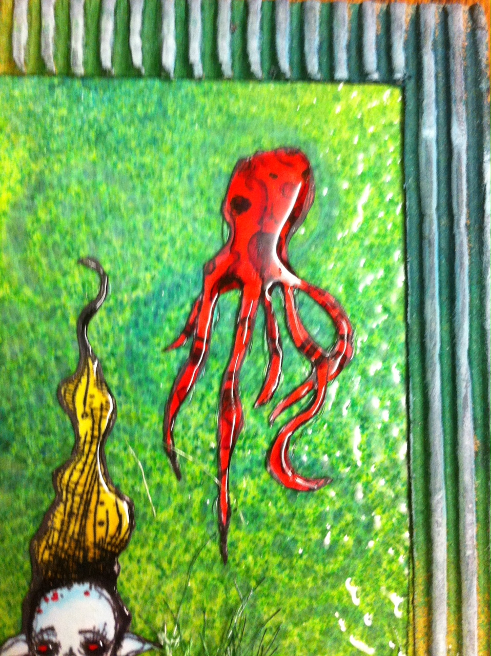
I decided to do another fat page in my little book of dark arts.I started by using Dylusion sprays for the back ground, lime green, blue and turquoise.When that was dry I used a mask and some blue distress inks just to add some interest, I over stamped the whole thing with a cover a card stamp using light blue archival ink to give it the look of some texture. The sentiment is from Dyan Reaveley and I though it was quite fitting for this challenge. The whole page was then covered with a thinish layer of UTEE, this really helps bring colours out and to make them pop, it also added to the under water feel giving a translucent layer and with it being on the thin side it has little pok marks and dimples that catch the light. To me it almost looks wet.
The image is from Stampotique and was sent to my by my blog friend Suzanne/Grainne who recently did an Atc swap with me (more in the week on that) it was just a happy coincidence that it was perfect for this challenge, so Thank you very much Suzanne. x
I coloured her up with my copic's. Keeping it very simple I did her skin a very light shade of blue, it almost looks white, I did her lower body in red to match the little squid and give me a contrasting colour as there was a lot of blue/green going on.To finish her and the squid off I coated them with Glossy Accents I left her skin clear of it so there was still some matt elements to the page.
There are also a couple of clumps of seaweed along the bottom, these were made with some hairy/frilly pipe cleaner ribbon stuff from the Craft Barn, they were also coloured with the Dylusion sprays.
It was finished of with a frame cut from an old cardboard box, this was also coloured using the Dylusion sprays but being on a brown box it looked a little heavy and dark so I used the picket fence distress ink over the raised part to lighten things up.
The challenge runs for a week and it would be great to see as many of you over there as poss, there are the other DT projects that are well worth stopping by for and to help you get into the mood.
We now have a list of the up and coming challenges for the next few weeks so you can get ahead of the game.
Again, thank you for stopping by.
I would like to enter this into a few challenges.
Anything But A Card are having a 'Shiny/Sparkly/Blingy' challenge
And now I finally have some stampotique images I can enter their challenge over at Stampotique Designers Challenge their challenge is 'Squares'
This week over at Haunted Design House our challenge is 'Creepy Criptids' If your not sure what a Cryptid is it's basicly a creature that is thought/believed by some or many to exist even though their is no scientific proof.
Nessie, Big Foot, Chupacabre etc, etc.
We are also sponsoured this week by Cryptocurium
As you can see I stuck with the same theme as last week and did a Mermaid.
I coloured her up with my copic's. Keeping it very simple I did her skin a very light shade of blue, it almost looks white, I did her lower body in red to match the little squid and give me a contrasting colour as there was a lot of blue/green going on.To finish her and the squid off I coated them with Glossy Accents I left her skin clear of it so there was still some matt elements to the page.
There are also a couple of clumps of seaweed along the bottom, these were made with some hairy/frilly pipe cleaner ribbon stuff from the Craft Barn, they were also coloured with the Dylusion sprays.
It was finished of with a frame cut from an old cardboard box, this was also coloured using the Dylusion sprays but being on a brown box it looked a little heavy and dark so I used the picket fence distress ink over the raised part to lighten things up.
The challenge runs for a week and it would be great to see as many of you over there as poss, there are the other DT projects that are well worth stopping by for and to help you get into the mood.
We now have a list of the up and coming challenges for the next few weeks so you can get ahead of the game.
Again, thank you for stopping by.
I would like to enter this into a few challenges.
Anything But A Card are having a 'Shiny/Sparkly/Blingy' challenge
And now I finally have some stampotique images I can enter their challenge over at Stampotique Designers Challenge their challenge is 'Squares'
Subscribe to:
Posts (Atom)